You
식당에서 음식은 어떻게 주문해요?
How do I order food?
Tap to speak
Hi, I’m Genie.
How can I help you?
You
식당에서 음식은 어떻게 주문해요?
How do I order food?
Genie
I’d like the chicken, please.
치킨으로 할게요.
Timeline
3 Months
Role
Product Designer
Team
Suvina, Hannah, Sue, Rain
Impact
15% increase in enrollment
Context
Jersey City Free Public Library offers free ESL classes and community resources for adult immigrants. But before students could benefit from them, they had to navigate a complicated registration process, language barriers, and disconnected systems.
We initially set out to improve the digital learning experience. After spending time with students and instructors, we realized the experience needed attention much earlier.
The first barrier wasn't learning English. It was getting into the class.
“The most difficult part was the registration. I had to ask my husband to help me.” — ESL Student
Solution
0:00 / 0:00
The problem
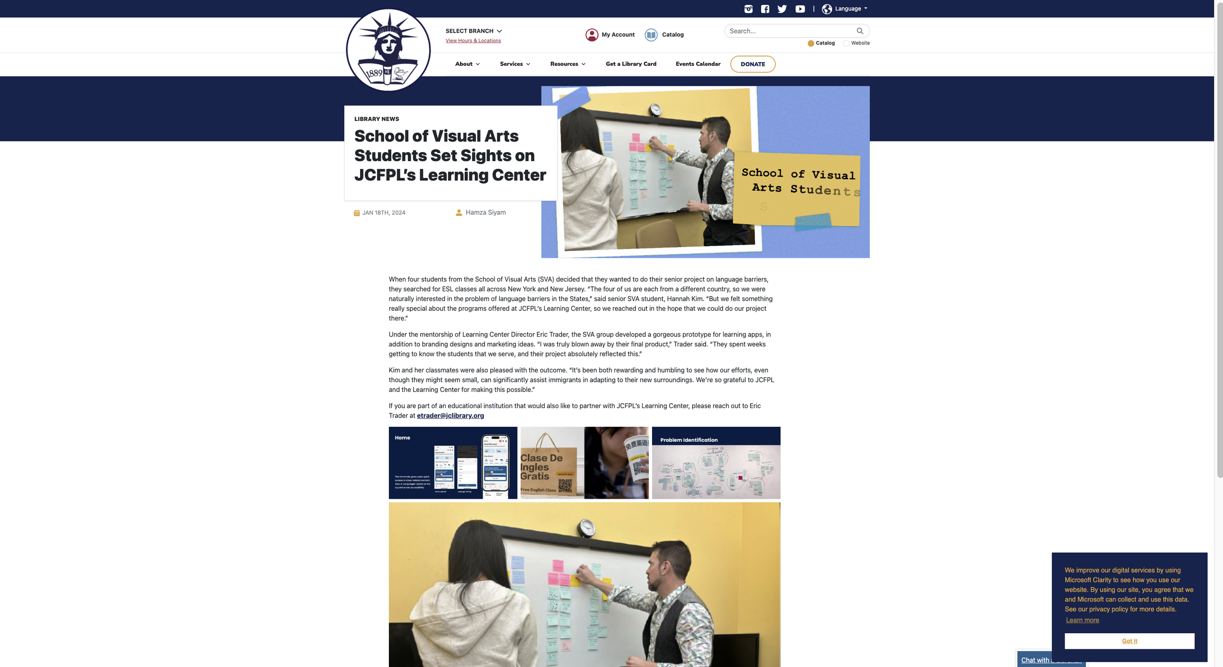
We observed ESL classes, interviewed more than 10 students, surveyed 40+ adult immigrants, and worked directly with instructors and library staff. Four problems kept coming up:
“Speaking English daily, like at school or the market, is difficult... I want to speak confidently.” — ESL Student
Daily situations like school or the market were difficult, and students often relied on someone else to translate.
Free legal help, workshops, and classes existed, but students rarely knew they were there.
The process was long, outdated, and hard to finish without help from someone who already spoke English.
Students needed 80% attendance to pass, and had no clear place to check whether they were on track.
Approach
Instead of treating registration and learning as separate problems, we designed around the full student journey.
That gave us two places to intervene: simplify access to the program now, while exploring a better experience for students once they joined.
Solutions
01. Registration process
Make the first step easier.
The existing registration process had multiple steps and was difficult to navigate for someone who was still learning English.
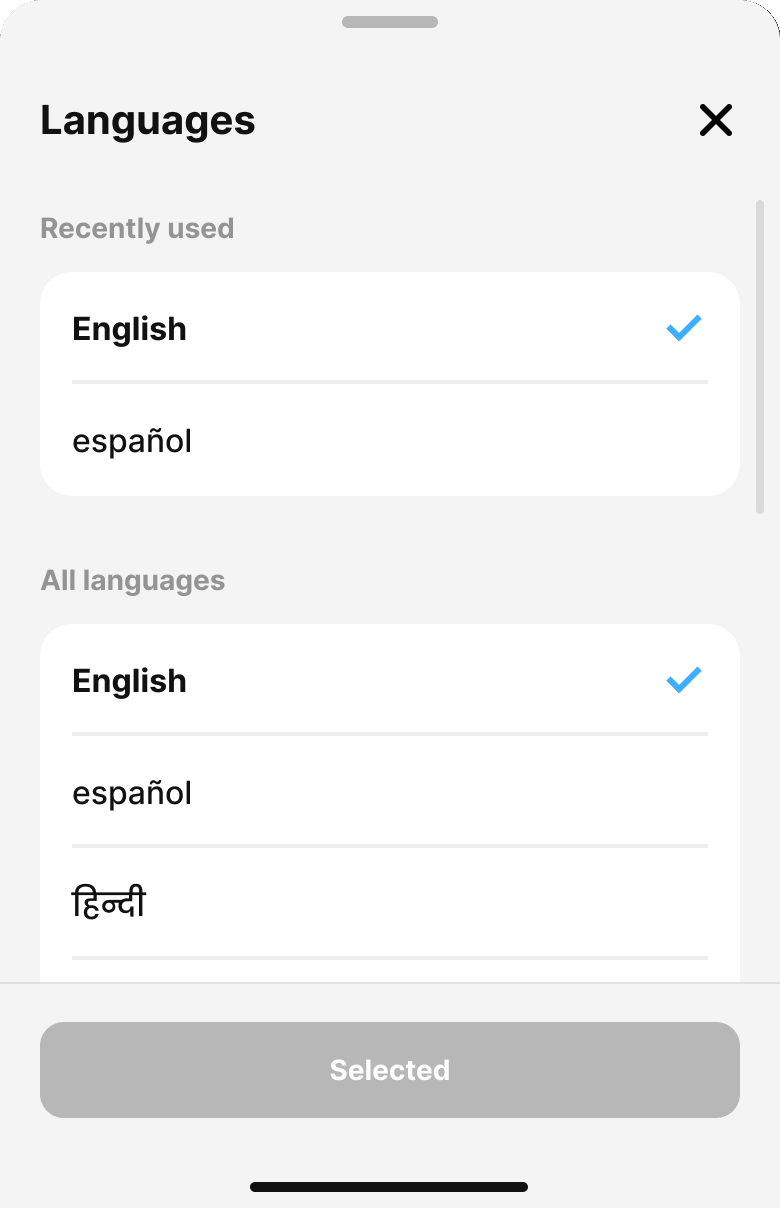
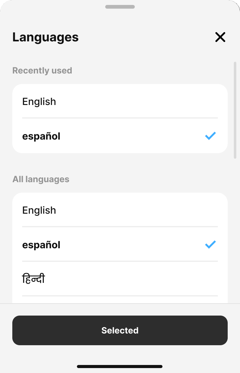
We simplified it into a shorter multilingual registration flow and created multilingual posters with QR codes that could be placed where potential students were already discovering library programs.
The goal was simple: remove as much friction as possible between wanting to learn English and joining a class.
Before
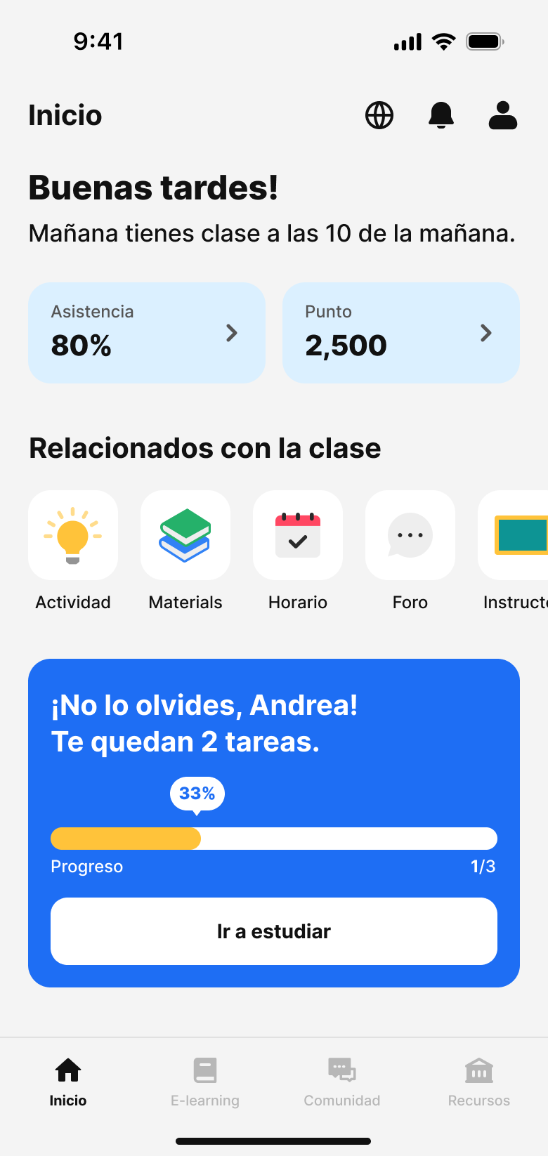
02. Home dashboard
Then, give students one place to understand their learning.
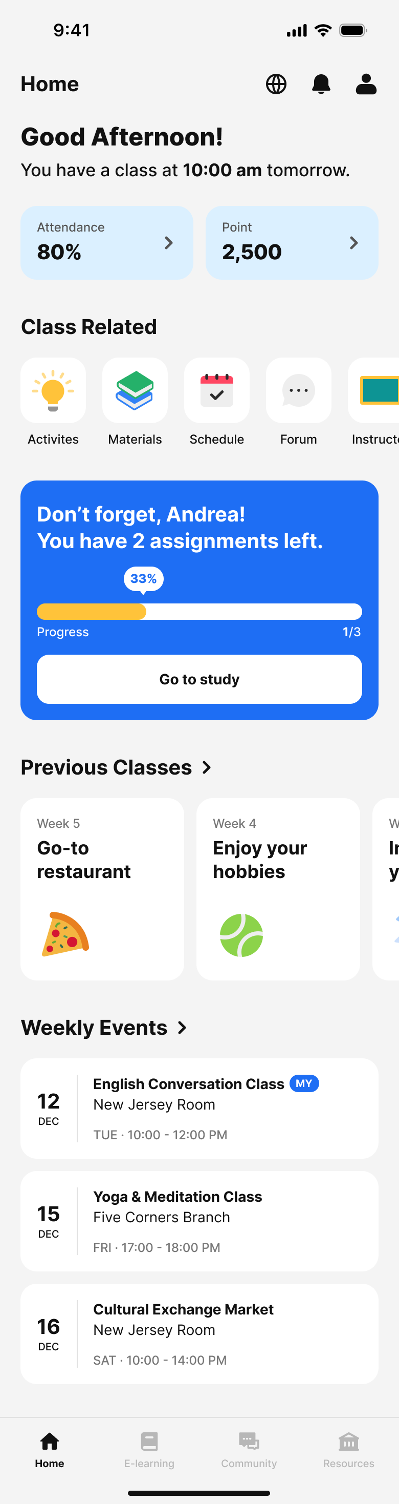
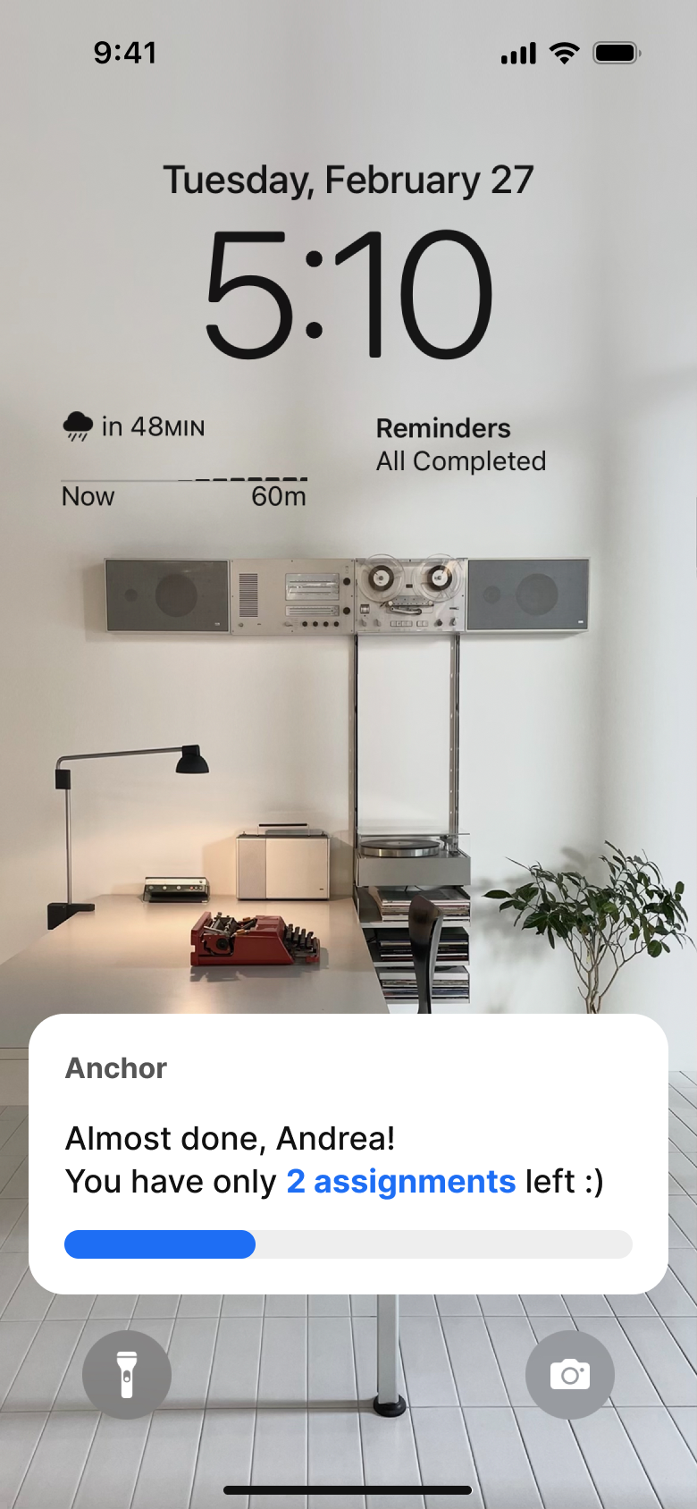
Once students joined a class, information about attendance, assignments, progress, resources, and practice was still fragmented.
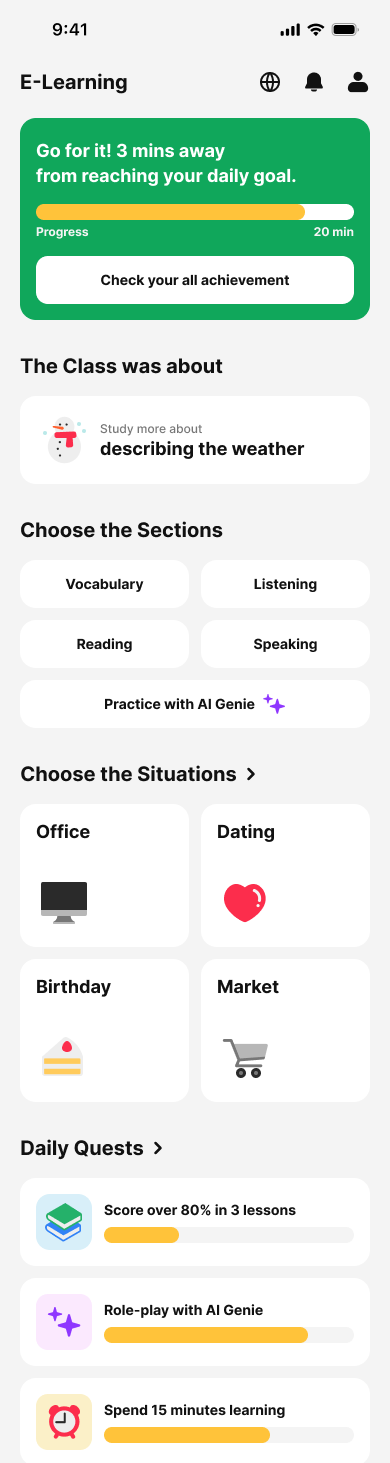
We designed Anchor, a learning companion that brought those pieces together.
The home experience prioritized the information students needed most: upcoming classes, assignments, attendance, and learning progress.
03. Real-world lesson
Make English practice feel closer to real life.
Our research showed that speaking was one of the most intimidating parts of learning English.
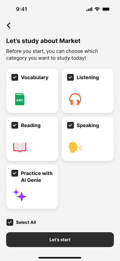
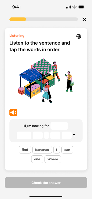
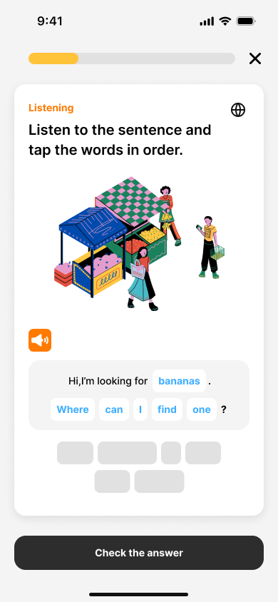
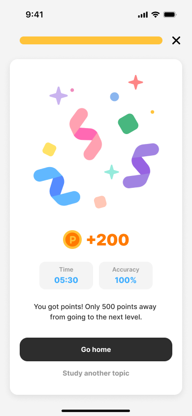
Instead of designing practice around abstract exercises, we explored everyday situations like shopping, dining, and healthcare.
We also designed AI Genie, a conversational practice space where students could rehearse speaking in a lower-pressure environment and receive feedback before using those skills in the real world.

AI Genie
Hi, I’m Genie.
How can I help you?
안녕 지니. ‘간장’이 영어로 뭐야?
‘간장’ in English is soy sauce
 Listen to pronunciation
Tap here to speak with Genie
Result
Increase in enrolment
15%
Positive response
8/10
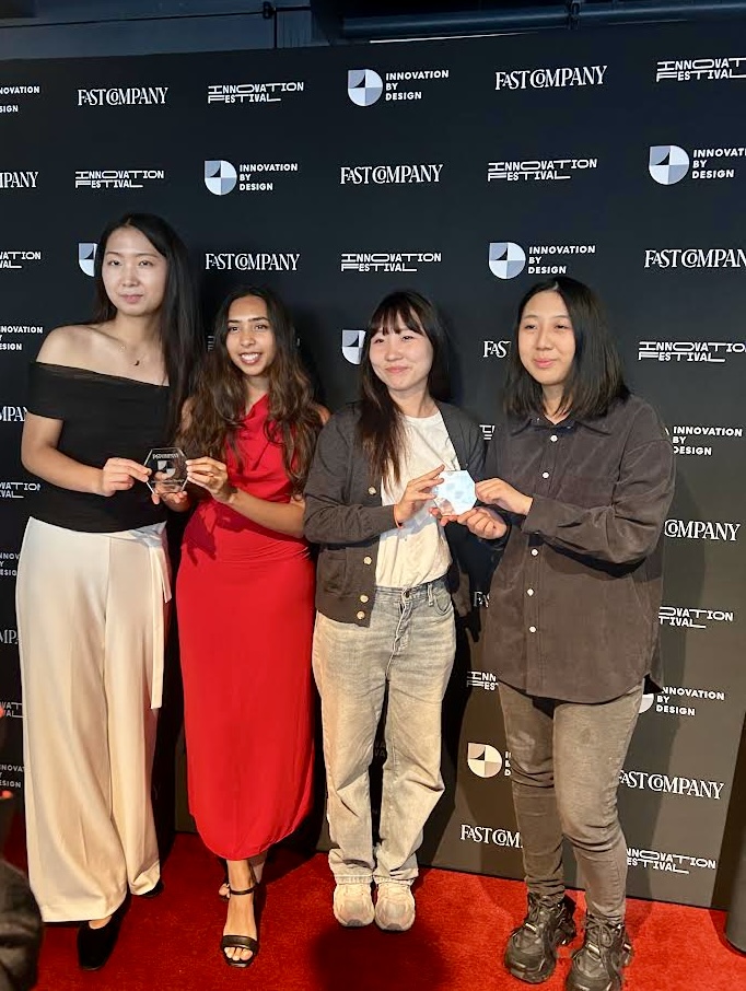
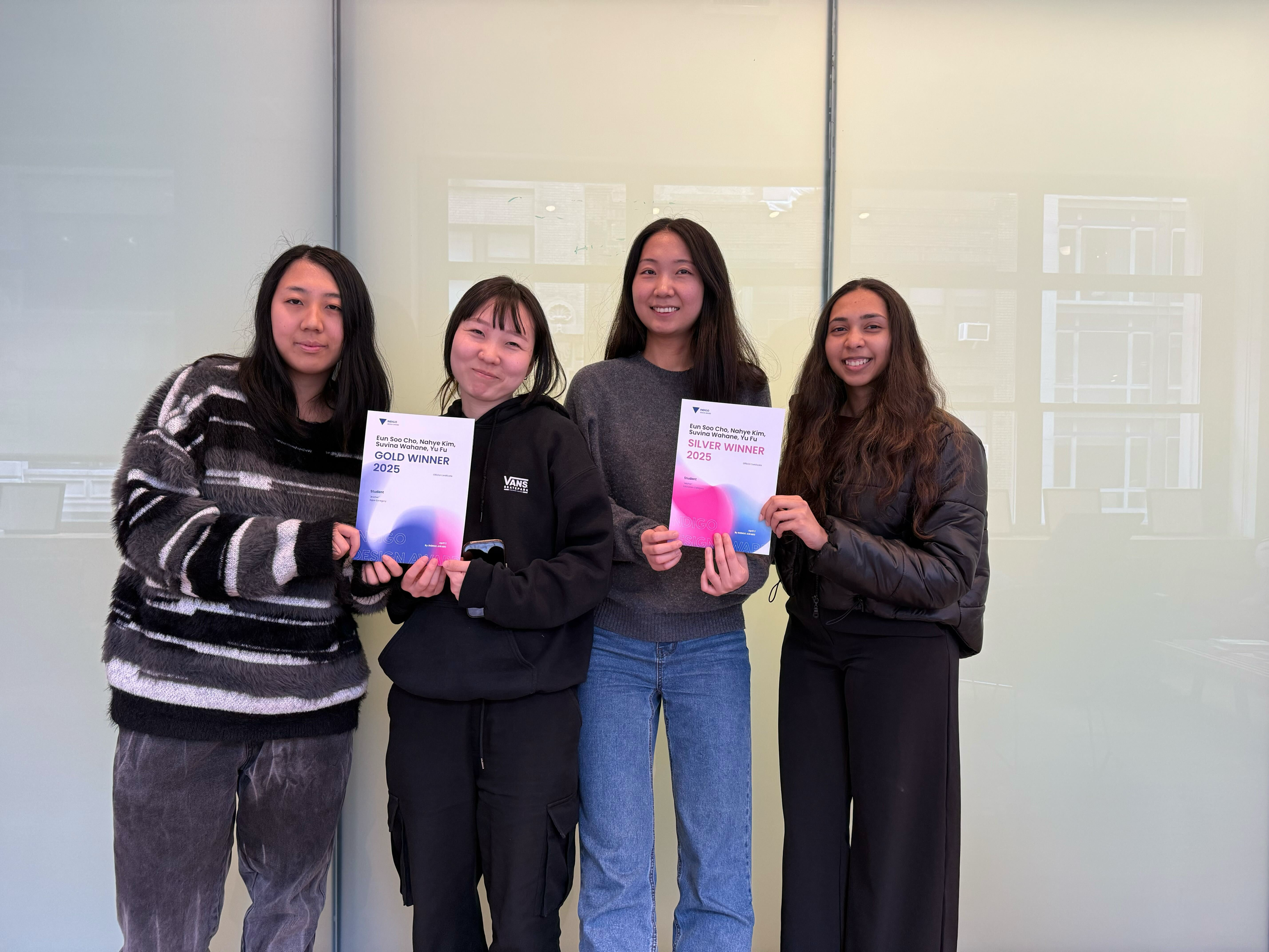
Awards
Reflection
We started the project thinking about how to design a better learning platform.
Spending time with students changed the question. Building a new learning experience mattered, but simplifying the first few minutes of someone's journey had an immediate effect on whether they could access that experience at all.
It taught me to look beyond the interface I was asked to design and find the moment where design could remove the most meaningful barrier.
View next